

For a few years now, I'm building UI of my projects with React, Next.js, and styled-components. I like writing my own components and reuse them across my projects.
The problem is I often spent some time writing props for my styled-components when I have to make them mobile-friendly with Media Queries, or duplicating props like margin, padding, flex… I usually ended up duplicating my components and add the needed styles, which can be a bad idea in bigger projects.
All the code is hosted on my Github, so make sure to check it out.
Summary
- The problem with styled-components, emotion...
- Styled-system to the rescue
- Improve performance with
compose
- Using variants
- Wrapping up and building a page
- Final notes
The problem with styled-components, emotion...
If your familiar with CSS-in-JS solutions like styled-components or emotion, you know certainly loosing some time when implementing a mobile-desktop friendly UI.
Here is an example, when you want to implement a different width depending on the screen size:
import styled from 'styled-components';

const Container = styled.div`
  display: grid;
	width: 100%;

	@media screen and (min-width: 40em) {
    width: 50%;
  }

	@media screen and (min-width: 52em) {
    width: 25%;
  }
`;
This example works fine, but if you need to reuse this component across your project and change the width parameter, it becomes more difficult. Here is an example with Typescript:
import styled from 'styled-components';

interface ContainerProps {
	smallWidth: string;
	mediumWidth: string;
	largeWidth: string;
}

const Container = styled.div<ContainerProps>`
  display: flex;
	width: ${({ largeWidth }) => largeWidth};

	@media screen and (min-width: 40em) {
    width: ${({ mediumWidth }) => mediumWidth};
  }

	@media screen and (min-width: 52em) {
    width: ${({ smallWidth }) => smallWidth};
  }
`;
Since we're only using the width CSS property this is fine but imagine using many... 😱
Styled-system to the rescue
This is where styled-system shines. It gives you many tools for the CSS-in-JS framework of your choice to save a lot of time and make your components easier to reuse across your code.
Consider the previous example, this is how it looks with styled-system and Typescript:
import styled from 'styled-components';
import { width, WidthProps } from 'styled-system';

const Container = styled.div<WidthProps>`
  display: flex;
  ${width}
`;
That's it. Your Container is now ready to use. Here is an example possibility:
import React from 'react;
import Container from './container.tsx';

const App = (): JSX.Element => (
	<Container width="100%">
		<Container width={["100%", "50%", "25%"]}>
			<h1>Hello world!</h1>
		</Container>
	</Container>
);
The values
100% and ["100%", "50%", "25%"] are both valid for the width prop. But what does it mean?// Use fixed 100% width. <Container width="100%"> <Container width={[ "100%", // 100% below the smallest breakpoint - Mobile "50%", // 50% from the next breakpoint and up - Tablets "25%", // 25% from the next breakpoint and up - Desktop ]}> <h1>Hello world!</h1> </Container> </Container>
By specifying a single value, such as
100%, we use a fixed value which doesn't change on different screen size.The second argument example
["100%", "50%", "25%"] means that we're using breakpoints which will use the specified values depending on the screen size.On the end, it will generate the following CSS code:
.Container {
  width: 100%;
}

@media screen and (min-width: 40em) {
  .Box-hash {
    width: 50%;
  }
}

@media screen and (min-width: 52em) {
  .Box-hash {
    width: 25%;
  }
}
Seems, familiar? This is the same code we had to write by hand when we wanted to create a truly responsive and reusable component. styled-components will take care of all the responsiveness of your component.
Imagine we want to add
margin and padding and color properties to our Container component, we can add them in a second:import styled from 'styled-components'; import { compose, width, space, color, WidthProps, SpaceProps, ColorProps, } from 'styled-system'; export type ContainerProps = WidthProps & SpaceProps & ColorProps; const Container = styled.div<ContainerProps>` display: flex; ${width} ${space} ${color} `;
By default, styled-system exposes a
space style which by default will add the padding and margin styled-components styles which will add the following props to your component:- margin, m
- marginTop, mt
- marginRight, mr
- marginBottom, mb
- marginLeft, ml
- marginX, mx
- marginY, my
- padding, p
- paddingTop, pt
- paddingRight, pr
- paddingBottom, pb
- paddingLeft, pl
- paddingX, px
- paddingY, py
And remember, all these props are responsive, you can give multiple values depending on the screen size. This saves us a lot of time and makes our component really reusable:
import React from 'react;
import Container from './container.tsx';

const App = (): JSX.Element => (
	<Container width="100%" margin={["5px", "15px", "30px"]}>
		<Container
			width={["100%", "50%", "25%"]}
			marginBottom="30px"
			marginX="20px"
			paddingY={["1rem", "3rem", "5rem"]}
		>
			<h1>Hello world!</h1>
		</Container>
	</Container>
);
Styled-components expose a lot of styles like this, you can check the API page to see the complete list.
Improve performance with compose
You can import and use the
compose util to combine multiple styles. It makes your code more readable and improve performances. So I highly recommend you to use it:import styled from 'styled-components'; import { compose, width, margin, padding, WidthProps, MarginProps, PaddingProps, } from 'styled-system'; const Container = styled.div<WidthProps & MarginProps & PaddingProps>` display: flex; ${compose(width, margin, padding)} // Combines all styles into one `;
Using variants
With styled-system, you can easily implement variants. A variant is used to create different styles for your component based on the variant name.
Imagine that we want to create a button with two variants:
primary and secondary with different colors. How can we achieve that with styled-system?import styled from 'styled-components'; import { variant } from 'styled-system'; // Define the variant types. export interface ButtonProps { variant: 'primary' | 'secondary'; }; const Button = styled.button<ButtonProps>` // Define default styles for our button. // These styles will be used by both variants and replaced // by variant value on conflict. font-size: 1rem; font-weight: bold; border: none; border-radius: 12px; padding: 18px 50px; cursor: pointer; color: white; ${variant({ // Specify our list of variants. variants: { // Defines primary variant styles. primary: { backgroundColor: 'black', }, // Defines secondary variant styles. secondary: { backgroundColor: 'blueviolet', }, }, })} `; // <Button variant='primary' /> // <Button variant='secondary' />
And that's it. The
variant util takes an object as input with the key variants that define our different variants. Inside we defined the primary and secondary variants with the backgroundColor style. Since I'm using Typescript, I also have to define the
ButtonProps with the variant prop and the two variants names I defined. Note that you can also change the variant prop key to have multiple variants such as the following:variant({ prop: 'size', variants: { big: { fontSize: 4, lineHeight: 'heading', }, small: { fontSize: 1, lineHeight: 'body', }, } }) // <Text size='big' />
We can change the default
variant prop to size so we have a variant for the size of the component.Wrapping up and building a page
Since you saw some basics about styled-system, let's try to build a page with it based on what we previously saw.
When you need to display elements in columns or rows, you can use the CSS Grids. They are really easily used and widely supported. Let's create a Grid component to use them.
import styled from 'styled-components';
import {
  compose,
  grid,
  space,
  flexbox,
  GridProps,
  SpaceProps,
  FlexboxProps,
} from 'styled-system';

// Define the Grid Props for Typescript.
export type Props = GridProps & SpaceProps & FlexboxProps;

const Grid = styled.div<Props>`
  // Set default styles for our Grid.
  display: grid;

  // Use compose to combine all our styles into one for performance.
  ${compose(grid, space, flexbox)}
`;

export default Grid;
We set a
display: grid style property to use CSS Grid. Then we just import the grid, space, and flexbox styles and we're done. Our component is ready and exposes all the props we need to reuse and customize our component.And then we will modify our Button component to change the style and add more style props:
import styled from 'styled-components';
import {
  variant,
  compose,
  width,
  space,
  color,
  WidthProps,
  SpaceProps,
  ColorProps,
} from 'styled-system';

// Defines ButtonProps and the variant prop for Typescript.
export type ButtonProps = WidthProps &
  SpaceProps &
  ColorProps & {
    variant: 'primary' | 'secondary';
  };

const Button = styled.button<ButtonProps>`
  // Define default styles for our button.
  // These styles will be used by both variants and replaced by variant value on conflict.
  font-size: 1rem;
  font-weight: bold;
  border: none;
  border-radius: 12px;
  padding: 18px 50px;
  cursor: pointer;
  transition: all 0.15s ease-in-out 0s;
  color: white;

  // Add Button animation on hover.
  &:hover {
    transform: scale(1.04);
  }

  // Use compose to combine all our styles into one for performance.
  ${compose(
    variant({
      // Specify our list of variants.
      variants: {
        // Defines primary variant styles.
        primary: {
          backgroundColor: 'black',
        },
        // Defines secondary variant styles.
        secondary: {
          backgroundColor: 'blueviolet',
        },
      },
      // Use width, space and colors styles.
    }),
    width,
    space,
    color,
  )}
`;

export default Button;
Good, our Button and Grid components are ready to use! Let's give it a try:
import React from 'react';

import Grid from './components/Grid';
import Button from './components/Button';

const App = (): JSX.Element => (
  <Grid justifyItems="center" my="5rem">
    <h1>Styled-system example</h1>
    <Grid justifyItems="center" my="4rem">
      <h2>Example buttons</h2>
      {/*
        Use Responsive Styles with the gridTemplateColumns style.
				This results in the following layout:
          Small - 1 button per line
          Medium - 2 buttons per line
          Large - 3 buttons per line
          Extra Large - 4 buttons per line
      */}
      <Grid
        gridTemplateColumns={[
          '1fr',
          'repeat(2, 1fr)',
          'repeat(3, 1fr)',
          'repeat(4, 1fr)',
        ]}
        gridGap="1rem"
      >
        <Button variant="primary">Primary</Button>
        <Button variant="secondary">Secondary</Button>
        <Button variant="primary" bg="plum">
          Plum Color
        </Button>
        <Button variant="primary" bg="thistle">
          Thistle prop
        </Button>
      </Grid>
    </Grid>
	</Grid>
);

export default App;
This will create the following page, which is responsive to screen size changes:
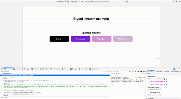
This is thanks to the
gridTemplateColumns={[]} prop, which changes the number of columns depending on the screen size.We also used the
variant prop of the Button component and overwritten the background-color with some colors. Final notes
As you saw styled-system can save you a lot of time. I recommend you to combine it with
styled-system or any other CSS-in-JSS framework you're using to make your components reusable and really customizable. No more: « Oh! Your component is missing the margin-right or the padding-left props».I advise you to go on the styled-system website, to discover more and find more usages. In this post, I only covered some cases I personally love about this library.
The code of this article and more examples are available on the Github repository of this article. As always a Github Star and a share is the best way to support me, so thanks a lot if you do so!
Happy CSSing 👋